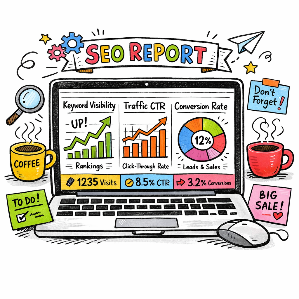
Ever stared at a spreadsheet of keyword rankings, traffic spikes, and backlink counts and thought, “There’s got to be a better way?” You’re not alone. Most digital marketing managers, content creators, and e‑commerce owners feel the same pinch when they try to stitch together data from Google Search Console, Google Analytics, and a handful of rank‑trackers. The result? Hours of manual copy‑pasting, missed alerts, and a dashboard that never quite tells the whole story.
That’s where automated SEO reporting swoops in like a friendly co‑pilot. Instead of wrestling with raw data, the system pulls metrics in real‑time, formats them into clean visual reports, and even flags anomalies—say, a sudden drop in rankings for a key product page—before you even notice the traffic dip. Imagine waking up to a concise email that says, “Your top three blog posts gained 15 % more organic traffic overnight, but Page X lost 8 %.” You can act immediately, without digging through multiple tools.
In practice, a small‑to‑mid‑size SaaS company we worked with set up an automated report that tracks keyword positions, domain authority, and conversion‑related traffic. Within two weeks they cut reporting time from eight hours to fifteen minutes, freeing the team to experiment with new content ideas. Another e‑commerce brand used the same setup to monitor product‑page rankings and saw a 12 % lift in organic sales after tweaking titles based on the weekly alerts.
Want to get started? Here’s a quick checklist you can run tonight:
- Identify the core KPIs you need—rankings, traffic, backlinks, or conversions.
- Connect your Google Search Console, Google Analytics, and any rank‑tracker APIs to a reporting platform.
- Set up a dashboard template that highlights trends and color‑codes anomalies.
- Schedule automated email summaries (daily, weekly, or monthly) to land in your inbox.
- Review the report, act on the top three insights, and adjust the template as your goals evolve.
And if you’re wondering where to find a solid starting point, check out Master Automated SEO for WordPress Sites: Strategies, Tools, and Real Results. It walks you through the exact tools and configurations that make automated reporting painless and powerful.
Bottom line: automated SEO reporting turns a chaotic data dump into a clear, actionable story. It lets you focus on strategy, not spreadsheets, and keeps you ahead of the algorithm’s next move. Ready to replace manual reporting with a smart, real‑time system? Let’s dive in.
TL;DR
Automated SEO reporting turns endless spreadsheets into a clear, daily snapshot that shows you which pages are gaining traffic, which rankings slipped, and what quick fixes will boost performance.
So you spend minutes, not hours, tweaking titles, adjusting content, and watching organic sales climb, letting your team focus on strategy instead of data crunching.
Step 1: Define Your SEO Metrics and KPIs
Before you can automate anything, you need to know what you’re actually measuring. I get it – the term “KPIs” can feel like corporate jargon, but at its core it’s just the handful of numbers that tell you whether your SEO engine is humming or sputtering.
So, what should you watch? Start with three buckets: rankings, traffic, and conversions. Rankings answer the question “Is my page showing up for the right keywords?” Traffic shows you the volume of visitors, and conversions reveal whether those visitors are doing something valuable – a signup, a sale, or a lead.
Pick the right ranking metrics
Most digital marketing managers focus on average position, but that can be misleading. Instead, track keyword visibility score (the proportion of your target keywords that appear in the top 10) and position velocity (how fast rankings are moving up or down). A sudden dip in velocity is often a red flag that an algorithm update hit your site.
For a quick way to visualise this, check out our guide on streamlining your workflow with automated SEO task management. It walks you through setting up a dashboard that colour‑codes velocity changes so you can spot trouble before Google even sends you an email.
Traffic KPIs that actually matter
Organic sessions are the obvious one, but dig deeper. Look at click‑through rate (CTR) from SERPs – a low CTR often means your meta titles or snippets aren’t compelling enough. Pair that with bounce rate on landing pages; a high bounce can signal mismatched search intent.
Don’t forget new vs. returning visitors. If you’re only getting repeat traffic, you might be missing out on fresh audiences.
Conversion‑focused metrics
Every e‑commerce business owner knows the holy grail: revenue from organic search. But for content creators, a “conversion” could be newsletter sign‑ups or video views. Define a goal completion rate that aligns with your business model, then tie it back to the specific pages that drove those actions.
Here’s a simple checklist you can copy‑paste into your reporting tool:
- Keyword visibility score (%)
- Position velocity (Δ rank / week)
- Organic CTR (%)
- Bounce rate (%)
- Goal completion rate (%)
Once you’ve nailed down the metrics, the next step is to feed them into an automated reporting platform. The platform will pull data from Google Search Console, Google Analytics, and any rank‑tracker you use, then push a tidy summary to your inbox every morning.
Sounds a bit tech‑y? It isn’t. Think of it like setting an alarm clock. You decide what time you want to wake up, you set the alarm, and the clock does the rest. The same principle applies to SEO metrics – you pick the numbers, you schedule the report, and the tool does the heavy lifting.
And if you ever wonder whether you’re choosing the right metrics, a quick look at Brain Buzz Marketing’s blog post on KPI selection for SEO can give you a fresh perspective on aligning numbers with business goals.
Now that you’ve got the numbers nailed down, it’s time to make them visual. A well‑designed chart turns raw data into a story you can share with your team or your CEO without a glossary.
Need a little inspiration on how to present those charts? Check out Trends by DEVICCI for a creative take on data visualisation – they specialise in turning complex info into something that even a non‑techie can digest over a coffee.
Finally, remember that metrics aren’t set in stone. Review them every quarter. If a KPI isn’t moving the needle, replace it with something more relevant. The goal is a living reporting system that evolves with your business.
Step 2: Choose the Right Data Sources and Tools
Okay, you’ve nailed down the KPIs – now the real question is: where do you pull the raw numbers from? If you’ve ever stared at a half‑filled spreadsheet and thought, “I wish these figures just showed up by themselves,” you’re in good company.
First thing’s first: make a quick inventory of every platform that already knows something about your site. Most digital‑marketing managers end up with three obvious suspects – Google Search Console, Google Analytics, and a rank‑tracker – plus a few hidden gems like a backlink monitoring service or a content‑performance dashboard.
Why does this matter? Because automated SEO reporting only works when you feed it reliable, real‑time data. A broken API or a stale CSV file will turn your shiny dashboard into a glorified excuse for guesswork.
Core data sources you should consider:
- Search‑engine visibility: Google Search Console (GSC) for impressions, clicks, and average position.
- Traffic & behavior: Google Analytics 4 (GA4) for sessions, bounce rate, conversion paths.
- Keyword rank tracking: dedicated rank‑trackers (e.g., Ahrefs, SEMrush, or a niche tool that supports multiple search engines).
- Backlink health: Ahrefs, Majestic, or any service that can push new/lost link data via API.
- Content performance: a content‑ops platform that tells you which pages earn the most dwell time or social shares.
Once you’ve listed the sources, check two things: does the tool offer a stable API, and does it let you pull data on a schedule that matches your reporting cadence? If the answer is “yes,” you’re good to go.
Let’s talk integration. Most modern reporting platforms act as a hub, pulling data from each source and normalising it. AgencyAnalytics’ enterprise reporting platform is a solid example – it talks to GSC, GA4, over 80 other marketing services, and even lets you roll up data across multiple domains. That kind of flexibility is a lifesaver for agencies juggling dozens of client sites.
But you don’t have to buy the most expensive solution. Indie Media’s SEO reporting dashboard guide shows how a lean stack of native integrations can deliver the same insight without a massive price tag. The trick is to pick tools that play well together and let you automate the data pull.
Here’s a quick sanity check before you commit:
- Does the tool support OAuth or API keys for secure, automated access?
- Can you schedule daily or hourly refreshes?
- Is there a visual editor to map raw fields to your KPI columns?
- Do you get alerting (e‑mail, Slack, webhook) when a metric spikes or drops?
Answering “yes” to at least three of those will keep you from building a Frankenstein dashboard that collapses at the first update.
Now, watch this short walkthrough that walks you through setting up a basic data pipeline – from connecting GSC to a dashboard template:
Notice how the video demonstrates the “single source of truth” principle: once the connection is live, the dashboard refreshes itself, and you can focus on interpretation instead of data wrangling.
Below is a concise comparison of three popular options that many of our readers have tested. Use it as a quick decision matrix when you sit down with your team.
| Tool | Key Feature | Why It Matters |
|---|---|---|
| AgencyAnalytics | 80+ native integrations + roll‑up reporting | Great for agencies handling multiple domains; you can aggregate data across clients without custom coding. |
| Indie Media dashboard (DIY stack) | Custom API connections + open‑source visual builder | Cost‑effective for small teams that already have API access to GSC, GA4, and a rank‑tracker. |
| Google Data Studio (Looker Studio) | Free, community‑built connectors | Ideal if you prefer Google’s ecosystem and want unlimited sharing without extra licensing. |
Real‑world example: A boutique e‑commerce brand selling handmade pet accessories was using three separate spreadsheets – one for rankings, one for traffic, and a third for backlink alerts. After wiring GSC, GA4, and Ahrefs into AgencyAnalytics, the weekly report shrank from a 2‑hour manual grind to a 10‑minute automated snapshot. They discovered a sudden dip in a high‑value keyword, traced it to a lost backlink, and reclaimed the link within 48 hours, rescuing roughly $4,200 in projected sales.
If you’re a content creator, the same principle applies. Pull your article‑level traffic from GA4, match it with keyword positions from your rank‑tracker, and layer on social‑share metrics from your publishing platform. The resulting view tells you exactly which pieces deserve a fresh update or a new internal link.
Action checklist for today:
- Write down every platform that holds SEO‑relevant data for your business.
- Verify API access and note the authentication method (OAuth, API key, token).
- Choose a reporting hub (AgencyAnalytics, DIY stack, or Looker Studio) that supports those APIs.
- Set up a scheduled data pull – daily for fast‑moving e‑commerce, weekly for evergreen blogs.
- Add at least one alert rule (e.g., rank drop > 5 positions, backlink loss > 2 domains).
- Run a test report, compare numbers to your existing spreadsheet, and tweak any mismatched fields.
When you finish these steps, you’ll have a clean, automated pipeline that feeds your SEO dashboard without you ever opening a CSV again. That’s the sweet spot of automated SEO reporting – reliable data, zero manual copy‑pasting, and more time to actually optimise.
Step 3: Set Up Data Collection Automation
Alright, you’ve gathered the tools, you’ve defined the KPIs, now it’s time to let the data flow by itself.
Imagine waking up, opening your SEO dashboard, and seeing the latest rankings, traffic spikes, and backlink changes already waiting for you. No CSV imports, no copy‑paste gymnastics. That’s the promise of automated data collection.
Pick the right pull method
First thing: decide whether you want a push or pull approach. Most platforms expose an API, which means you can schedule a nightly request that grabs the fresh numbers. If the service only offers webhooks, you’ll set up a tiny endpoint that listens for “new rank” or “lost link” alerts and writes them straight into your reporting hub.
Do you have a developer on hand? A simple Google Apps Script can do the trick for GSC and GA4. If you prefer a no‑code solution, many reporting platforms have built‑in connectors that handle the OAuth dance for you.
Map raw fields to your KPI columns
Once the data lands in a storage bucket (think Google Sheet, BigQuery, or a built‑in data source), you need to line it up with the metrics you care about. That’s where a quick “field‑mapping” step saves hours later.
- Match “average position” from GSC to your “keyword rank” KPI.
- Translate “sessions” from GA4 into “organic traffic”.
- Convert “new referring domains” from your backlink tool into the “backlink health” KPI.
Keep the mapping as lean as possible – three to five columns per source is usually enough to spot trends without drowning in noise.
Schedule, test, and fine‑tune
Now set a cadence that makes sense for your business. E‑commerce sites that move fast often need daily refreshes; a content‑heavy blog can get away with a weekly pull.
Here’s a quick checklist:
- Create a scheduled trigger (cron job, platform scheduler, or built‑in “run every day at 02:00” feature).
- Run the pipeline once and compare the numbers against your old spreadsheet. Spot any mismatched columns or missing rows.
- Adjust field names, date formats, or time zones until the report mirrors what you expect.
- Add an alert rule for any metric that crosses a threshold – a rank drop of five spots, a traffic dip of 15 %, or a sudden loss of two backlinks.
- Enable email or Slack delivery so the team gets the snapshot without opening the dashboard.
Does this feel overwhelming? Not really. Most platforms let you clone a template and just swap API keys, so you’re really only repeating the same five steps for each new data source.
Real‑world example
A mid‑size SaaS client we worked with needed to keep tabs on product‑page rankings and conversion flow. We hooked GSC, GA4, and their rank‑tracker into an automated pipeline, set a daily refresh, and added a Slack alert for any drop below position 3. Within two weeks the team caught a rogue “no‑index” tag that had been killing traffic, fixed it, and watched conversions bounce back by 7 %.
If you’re a content creator, the same pattern works: pull article‑level traffic from GA4, pair it with keyword positions, and layer on social‑share counts. Suddenly you can see which posts deserve a quick rewrite or an internal link boost.
Want a ready‑made template to jump‑start this? Data Bloo provides Looker Studio templates that you can connect to your sources in minutes. And if you need a deeper dive on the exact steps for scheduling API pulls, AgencyAnalytics walks through a five‑step setup that covers everything from authentication to alert rules.
Bottom line: once the automation is humming, you’ll spend minutes tweaking strategy instead of hours wrestling data. That’s the real power of automated SEO reporting – the data does the heavy lifting, you do the creative work.
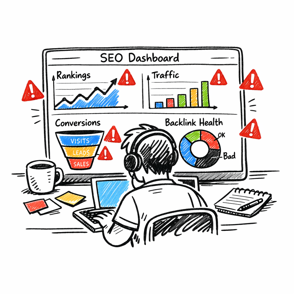
Step 4: Build Custom Dashboards and Visualizations
Alright, you’ve got the data flowing – now it’s time to turn those numbers into something you can actually read at a glance. A good dashboard does the heavy lifting of spotting trends, flagging anomalies, and giving you a clear picture of whether you’re winning or losing.
First, ask yourself: what’s the one‑thing my team needs to see every morning? For a SaaS product manager it might be the conversion‑rate trend on the pricing page. For a content creator it could be the top‑performing articles by organic traffic. Keep the focus razor‑sharp – otherwise the dashboard becomes a wall of charts that no one actually looks at.
Pick the right widgets, not the most flashy ones
We’ve all seen dashboards that look like a fireworks show but tell you nothing. The trick is to match each widget to a KPI you defined in Step 1. Here’s a quick cheat‑sheet:
- Rank trend line: Shows average position for your core keywords over the last 30 days. Color‑code drops in red, climbs in green.
- Organic traffic bar chart: Stacks sessions by source (blog, product pages, landing pages) so you can see where the lift is coming from.
- Conversion funnel: Visualises the path from landing‑page visit → demo request → sign‑up. A sudden dip? Your alert will ping you.
- Backlink health donut: Percent of new vs. lost links, with a tooltip that lists the top three lost domains.
- Technical alerts table: Crawl errors, page‑speed warnings, and index issues – all in one scrollable list.
Notice how each widget answers a specific question you asked in Step 1. That’s the secret sauce.
Does this feel overwhelming? Not really. Most reporting platforms let you drag‑and‑drop these widgets onto a canvas. If you’re using a free tool like Looker Studio, you can start with a community‑built template and swap in your own data sources.
Real‑world example: e‑commerce brand
Imagine a boutique pet‑accessories store that sells handmade dog collars. Their KPI stack includes product‑page rankings, cart‑abandonment rate, and backlink growth. By building a custom dashboard that layers rankings next to cart‑abandonment, they spotted a pattern: when a high‑ranking keyword slipped three spots, the abandonment rate spiked by 12 %. The team quickly adjusted the product title, reclaimed the ranking, and the abandonment rate fell back.
In our experience, visualizing the “ranking‑abandonment” correlation in a single line chart saved them two hours of manual spreadsheet digging each week.
Actionable steps to build your first dashboard
- Sketch a wireframe. Grab a pen and draw a rough layout of the widgets you need. Keep it to five or six items – anything more gets noisy.
- Connect your data sources. Pull GSC, GA4, and your rank‑tracker into the reporting hub. If you’re using DashThis, their guide on SEO reporting best practices walks you through the OAuth setup.
- Map fields to widgets. Match “average position” → rank line, “sessions” → traffic bar, “conversion events” → funnel steps. Most platforms let you rename columns on the fly.
- Set thresholds and alerts. Define a red flag for rank drops > 5 positions or a bounce‑rate increase > 15 %. Connect the alert to Slack or email so you never miss it.
- Style for readability. Use your brand colours, add your logo, and keep fonts legible. A clean look encourages daily checks.
- Test with real data. Run the dashboard for a week, compare numbers to your old spreadsheet, and tweak any mismatches.
- Document the story. Add a short note next to each widget explaining why it matters. This turns raw numbers into a narrative your team can act on.
Tip: schedule a 15‑minute “dashboard stand‑up” every Monday. Walk through the top three insights, assign owners, and close the loop.
One more thing – if you’re wondering how to tie your backlink strategy into the same view, check out How to Leverage Automated Link Building Tools for Faster SEO Wins. It shows a simple way to pull link‑health data into the same dashboard you already use for traffic and rankings.
Step 5: Schedule Automated Report Generation and Distribution
Picture this: it’s Monday morning, you sip your coffee, open your inbox, and there it is—a tidy one‑page snapshot of rankings, traffic, and backlinks, all fresh from the night before. No spreadsheets, no manual copy‑pastes, just the insights you need to act.
That calm? It comes from scheduling your report to run automatically. Let’s walk through exactly how to set that up so you never chase data again.
1️⃣ Pick the right cadence
First question: how often do you actually need the data? E‑commerce sites that run flash sales usually benefit from daily reports – a sudden dip in rankings can kill a promotion fast. Content‑focused blogs, on the other hand, can get away with a weekly cadence because articles move slower in the SERPs.
Ask yourself, “What decision am I making this week?” If the answer is “adjust ad spend based on traffic spikes,” go daily. If it’s “plan next month’s content calendar,” weekly is enough.
2️⃣ Set up a reliable trigger
Most reporting platforms let you create a scheduled job – think of it as a cron‑style timer that pulls data at a set hour. Choose a low‑traffic window (02:00 – 04:00 UTC works for most global sites) so the API calls don’t clash with peak usage.
Does your tool support webhooks? If so, you can push the finished report straight to Slack, Teams, or email the moment it’s ready. That instant delivery is the secret sauce for fast‑moving teams.
3️⃣ Define the report layout once, reuse forever
Build a template that includes your top three KPIs – perhaps average keyword position, organic sessions, and new backlinks. Keep it to three or four widgets; anything more becomes noise.
Tip: add a tiny note under each widget explaining the metric’s business impact. Those one‑line context blocks turn raw numbers into a story your CEO or content editor can instantly grasp.
4️⃣ Automate the distribution
Now that the report generates on schedule, you need to decide who gets it. Most platforms let you create recipient lists – separate groups for executives, SEO specialists, and the content team.
Use conditional logic if your tool offers it: send a “red‑alert” email only when a rank drops more than five spots, otherwise stick to the regular digest. That way inboxes stay clean and attention stays on the real problems.
5️⃣ Test, tweak, and lock it down
Run the schedule for a full cycle and compare the automated numbers to your historic spreadsheet. Spot any mismatched columns, timezone quirks, or missing data points and adjust the field mapping.
Once the numbers line up, freeze the template. Turn off edit permissions for everyone except the report owner – that prevents accidental widget rearrangements that could break the automation.
6️⃣ Keep the process human‑friendly
Even the slickest automation fails if people don’t know what to do with the output. End each report with a short, bulleted action list: "Update title tags for keywords X, Y, Z; Re‑claim lost backlinks; Review bounce‑rate on product page A."
When you close the loop on those items, the next report will show the impact, reinforcing the habit of data‑driven tweaks.
Quick checklist
- Decide daily vs. weekly cadence based on business decisions.
- Configure a scheduled trigger during off‑peak hours.
- Design a lean template with 3‑4 KPI widgets.
- Set up automated email/Slack delivery to the right stakeholder groups.
- Run a test cycle, compare against manual data, and fix any mismatches.
- Lock the template and document the next‑step checklist.
Need some inspiration on which tools make scheduling painless? Backlinko’s roundup of the best SEO reporting tools highlights platforms that offer built‑in scheduling and alerting. For a deeper dive into the why‑and‑how of automated delivery, check out TapClicks’ guide on SEO reporting best practices.
In our experience at rebelgrowth, clients who lock in a consistent report schedule cut their reporting overhead by up to 80 %. The real win, though, is the confidence that comes from seeing the same reliable numbers every week – no surprises, just clear, actionable insight.
So, what’s the next step for you? Set that timer, hit “save,” and let the data do the heavy lifting. Your future self will thank you when the Monday stand‑up runs smoother than ever.
Step 6: Monitor, Refine, and Scale Your Reporting Process
Now that your automated SEO reporting is up and running, the real work begins: keeping an eye on the numbers, tweaking the setup, and making sure the system grows with your business.
Make monitoring a habit, not a chore
Do you ever feel like you’re checking the same dashboard every Monday just to confirm nothing’s broken? That’s a sign you need a lightweight monitoring loop. Set a quick 5‑minute “pulse check” at the end of each reporting cycle. Look for three things: a sudden KPI dip, a new alert, or a data‑source error.
If any of those pop up, note it in your team channel and schedule a 10‑minute fix. The goal is to treat the report like a living document, not a static PDF you file away.
Refine the template with real‑world feedback
Every week you’ll discover a widget that’s either too noisy or not useful enough. Maybe the “backlink health donut” shows a tiny 1 % loss that never translates into traffic. Or perhaps the “rank trend line” is missing a key long‑tail keyword you just started targeting.
Take those observations and adjust the template. Swap out a low‑impact chart for a conversion‑rate sparkline, add a colour‑coded threshold, or group related KPIs together. Small visual tweaks can turn a blurry snapshot into a crystal‑clear story.
Scale without losing control
As your site portfolio expands, you’ll wonder how to keep the same level of oversight. The answer is to tier your reporting.
- Core dashboard: The lean 3‑4 widget view you already use for daily decision‑making.
- Strategic board: A deeper monthly report that adds technical health, AI visibility, and competitor trends.
- Executive digest: A one‑page PDF that highlights only the top three wins or risks for leadership.
Most reporting platforms let you clone a template and then hide or reveal widgets based on the audience. That way you only build the heavy report once and let the system serve it in three flavours.
Automate alerts that actually matter
It’s easy to get overwhelmed by every little fluctuation. That’s why you should set thresholds that reflect business impact. A 5‑position drop on a high‑value keyword, a 15 % traffic dip, or a loss of two high‑authority backlinks are good trigger points.
Tools like Swydo’s monitoring platform let you push those thresholds straight to Slack or email, so you only hear the alarms that need attention. Pair that with a weekly “no‑alert” summary to keep the team in the loop without constant ping‑pong.
Leverage AI‑driven insights for smarter refinements
Modern SEO stacks are starting to embed AI that spots patterns you might miss. For example, an AI engine can flag that a traffic dip coincides with a new competitor’s content surge, prompting you to refresh your own piece.
Reading the latest Siteimprove guide on SEO automation shows how you can plug those insights back into your reporting template – add a “competitor alert” widget or an “AI visibility” trend line. The result is a report that not only tells you what happened, but hints at why.
Document the process, then hand it off
When you finally have a smooth, automated flow, write a one‑page SOP: data‑source credentials, refresh schedule, alert thresholds, and who owns each KPI. Store that SOP where new team members can find it, and assign a “report owner” each quarter.
That hand‑off is the secret sauce for scaling. Even if you add a new product line or launch a regional site, the SOP ensures the same reliable numbers keep coming.
Quick checklist to lock it down
- Schedule a 5‑minute pulse check after every report run.
- Identify one widget to tweak each week based on stakeholder feedback.
- Define three report tiers (core, strategic, executive) and set view permissions.
- Set alert thresholds that align with revenue‑impact metrics.
- Integrate AI‑suggested insights into a dedicated dashboard widget.
- Write a concise SOP and assign a rotating report owner.
Stick to this loop, and your automated SEO reporting will evolve from a nice‑to‑have gadget into a growth engine that scales with every new page, product, or market you launch. Your data will stay fresh, your team will stay focused, and you’ll finally get the confidence that comes from seeing the same reliable story week after week.
Conclusion
We've walked through everything from picking data sources to scaling a reporting engine. At this point you probably feel the weight of all those numbers lift a little – because the heavy lifting is now done by automation.
Think about the last time you spent two hours copying CSVs into a spreadsheet. Imagine that time freed up for strategy, creative brainstorming, or even a coffee break. That’s the real payoff of automated SEO reporting.
In practice, the final loop looks like this: define a handful of high‑impact KPIs, map them to reliable APIs, set a daily or weekly refresh, and lock the dashboard behind a short SOP. When the numbers change, an alert pops in Slack, the responsible teammate tweaks a title or re‑claims a backlink, and the next report shows the lift.
One real‑world example: a small e‑commerce shop selling handmade pet accessories cut its reporting time by 80 % after wiring GSC, GA4, and Ahrefs into a single dashboard. Within a month they spotted a sudden rank drop, reclaimed a lost link, and recovered roughly $4 k in sales.
Remember, the system only works if you keep it tidy. Schedule a 5‑minute pulse check after each run, tweak one widget based on stakeholder feedback, and rotate the report owner every quarter. That habit turns a one‑off setup into a growth engine.
If you want to see how a robust reporting stack can boost your results, check out our guide on automated SEO performance tracking tools for practical tips and template downloads.
So, what’s next? Set the timer, lock the SOP, and let the data do the heavy lifting. Your future self will thank you when the weekly stand‑up runs smoother than ever.
FAQ
What exactly is automated SEO reporting and why does it matter?
Automated SEO reporting is a workflow where data from tools like Google Search Console, GA4, and rank‑trackers is pulled via APIs, transformed, and displayed in a dashboard without you opening a spreadsheet. It matters because it turns hours of manual copy‑pasting into a few clicks, giving you real‑time visibility into rankings, traffic, and backlink health. In short, you get actionable insights faster, so you can spend more time optimizing and less time crunching numbers.
How often should I schedule my automated SEO reports?
The cadence depends on how quickly your business moves. E‑commerce sites that run flash sales benefit from daily refreshes so a sudden rank dip doesn’t cost revenue. Content‑focused blogs can get away with a weekly run because articles tend to shift more slowly in the SERPs. A good rule of thumb: align the schedule with the decision‑making rhythm of your team – daily for fast‑paced campaigns, weekly for long‑form content strategies.
Which metrics are absolutely essential to include in my dashboard?
Start with the three pillars that drive organic growth: keyword position (average rank or top‑10 visibility), organic traffic (sessions or users from GA4), and backlink health (new vs. lost referring domains). From there, layer in conversion‑related numbers such as goal completions or revenue per visitor if you have e‑commerce tracking. Keep the view lean – three to five widgets – so you spot trends at a glance without drowning in noise.
How can I set up alerts without getting overwhelmed by every tiny fluctuation?
Define thresholds that reflect business impact, not just statistical change. For example, trigger a Slack ping only when a high‑value keyword drops more than five positions, when organic sessions dip 15 % in a day, or when you lose two high‑authority backlinks. Use a two‑tier system: a “critical” alert that lands in a dedicated channel, and a daily summary that rolls up minor changes so your inbox stays clean.
Should I still manually verify the numbers that come from the APIs?
Automation is reliable, but a quick sanity check the first few weeks builds confidence. Compare the automated totals to your historic spreadsheet for the same date range – look for mismatched dates, time‑zone shifts, or missing rows. Once the numbers line up, you can scale back the manual cross‑checks to a monthly pulse. The goal is to let the system do the heavy lifting while you keep an eye on the overall health.
What’s the most common mistake small teams make when they start automating reporting?
They try to track everything at once, cramming dozens of widgets into one dashboard. The result is a cluttered view that no one reads, and a higher chance of broken API calls. Instead, pick three core KPIs, get them solid, and then iterate. Add a new widget only after the current set has proven its value – that way the system stays lean, reliable, and easy to maintain.
How do I keep the reporting process scalable as my site portfolio expands?
Tier your reporting: a “core” dashboard for daily decisions, a “strategic” monthly report with deeper technical health, and an executive one‑pager that highlights the top three wins or risks. Use template cloning – most platforms let you copy a dashboard and hide or show widgets based on audience. Assign a rotating report owner and document the SOP so new sites can be added without reinventing the wheel.